
Sliders! Radio buttons! Dialog boxes! Menus! Progress bars! These are the instruments of our eternal contemporary torment! The ancient Greek gods would have approved! We are all Sisyphus now!
Let's Play: Ancient Greek Punishment: UI Edition is a new edition in the Let's Play: Ancient Greek Punishment series. In the UI Edition the myths are retold via classical user-interface experiences, from radio buttons to setup wizards to sliders.
Timeline
Premise; initial designs; UI elements available; mobile?
Premise
The base idea of this game is to recreate the spirit of the standard Let's Play: Ancient Greek Punishment game in the form of conventional user-interface elements. Not unlike It is as if you were making love in the sense that it's a translation of a particular (more human?) interactivity into the (inhuman?) language of UI.
The idea came about when I assigned "Sisyphus" as the theme for a project in my programming course dealing with jQuery and jQuery UI. I was talking to a student and had the image of a standard interface slider on an angle with the handle automatically dropping to the bottom every time you pull it to the top. And then I just assumed I could design all the rest of the games according to the same basic logic.
So let's get started - how would each of the five go? I must admit I've prepared some thoughts earlier while lying on the couch.
Sisyphus
A slider, ideally (?) on an angle to look like a hill. You are instructed to "Set the slider to 10" (or similar) but whenever you drag it up and slides back down again. This could be improved(?) if you had to click a "continue" button or something so that you have to let go of the slider handle - otherwise you might feel like you were succeeding if you grabbed it and held it in place? This in turn suggests that possible each punishment should be in a little window of its own. This in turn suggests that there should maybe be five application icons on the desktop that you can use to launch each one, potentially even simultaneously if you feel like it?
Quite like the idea, too, of mapping in my traditional Win95-era sounds to communciate things (though that makes normally-silent interactions a bit more videogame-y which may or may not be 'correct').
If I go the "individual applications" mode, so that the interfaces are in dialogs of their own, I wonder if the diagonal slider actually looks too awkward, and instead I should be embracing the more normal presentation (horiztonal/vertical) which the Sisyphean part being in the interaction itself and in the still-present resemblance between pushing a boulder up a hill and sliding a slider along a track, in both cases with the object reverting.
Danaids
Current vision is drag-and-drop interface with "water.png" or similar being dragged to a folder called "bath" maybe. Except it just reverts every time you drag it. So the instruction is "drag water.png to the bath folder" and that's always there, it's just impossible because the folder doesn't "accept it"? That's the simplest/purest version and I think it does convey the core: the bath doesn't "accept" the water in the original story because it has holes.
Guess there's a question of whether you'd want to convey the idea that the water does go in and then leaks away? But that's much more complex I think? How do you show it goes in but then comes in again? I think the simplest version might be the best here - I like the idea of reducing these things to be as simple as humanly possible, so it's about the purity of the interface in combination with the idea?
Tantalus
Instruction asks you to select with radio button either "Apple" or "Water" (it starts as "None"). And then you're meant to click Okay or Submit. But then we have some way of undoing your action. Multiple possibilities here?
- When you go to click on Apple or Water the options become disabled, so it's like you reach for them but they become out of reach
- More extravagant would be to move the entire dialog box to avoid you being able to select them, much more literal, but less leverage of UI language
- Could also have it such that you can select but when you go to click the submit button the selection defaults back to None?
Question: why can't you submit "None" in these cases? That doesn't really make sense? Could it be that there's only two radio buttons and they have no selection? Or should they be checkboxes instead with the same idea applied - they deselect? These are probably just things that need to be tried - the core concept is there.
Zeno
I'm less able to visualise this, but I like the idea of leveraging a recursive effect within an interface.
My initial vision was of a sequence of checkboxes you'd be selecting, and when you got halfway it would add as many again from where you are to the end, over and over. This is a bit weird because it's a strange UI behaviour that's not very real. However that idea of recursively expanding options could possibly be explored this way?
Another option I've thought of here is that it's a dropdown menu with "First half" and "Second half" or similar, and when you go to "Second half" it opens a new submenu with the same options, ad infinitum? The labelling here could be better really though, it's a bit underwhelming and I don't quite know what the instruction would be? What are you being asked to select?
Certainly menus seem the most "reasonable" place to have an infinite recursion? We're used to the idea of nested menus, and there's no reason (beyond design) not to have them recurse. I wonder what other recursive UI elements there are.
Maybe after these initial outlines I'll also just list the available elements and see what could fit best.
Prometheus
This has seemed the hardest to me. At a fundamental level I think it can be represented as a progress bar for your liver that is reduced in some way. I had thought perhaps that dialogs would pop up with a timer saying that they will default to a peck if you don't cancel them, but that couples the peck and the struggle in a way that isn't in the original game. In the original game the relationship is more modal - the eagle is perched or not and that's what you control, and in the perch mode you lose liver. But this is more complex to represent probably? "The eagle has landed" is a funny text to think of being in the UI though...
There is something nice about this one creating a potential profusion of dialogs though, I do like that idea. And there's nothing wrong per se with resisting the peck instead of the landing? That's not how the original game is, but I don't think it's anti-myth?
That said, consider just having one dialog at a time - what does the multitude add really? I guess it's evocative of life with popups which has merit, but it's less true to the myth in the sense there's just one eagle and one peck to resist at a time. Don't necessarily need the harried/overwhelmed vibe, which might diffuse the intensity of the one-to-one experience with the eagle? "Eagle alert!" "Alert: The Eagle has landed!"
You shouldn't be able to close any app once you've run it! Maybe even a dialog when you click the 'x' that explains the punishment/application is an infinite process. Hehe. Actually more generally the textual nature of this game might provide opportunities like that to explain/explore things more conceptually. An about dialog with a kind of "Welcome to Hades/Tartarus" discussion? HadesSoft?
UI Elements
Just for the record, these are the UI elements/widgets jQuery UI gives us to think about:
- Accordion
As in headers that expand... this is a pretty interesting candidate for Zeno?
- Autocomplete
As in a text box that provides suggestions as you type - haven't given this any thought at all.
- Button
Obviously useful everywhere as a standard idea. Can be used to convey effort if you're thinking about the interface to the original game, but my ideas at this point are being directed more toward UI specific expressions of the underlying concepts rather than UI re-expression of the interfaces of the games themselves.
- Checkbox
On or off. A possibility for Tantalus.
- Radio button
On or off, exclusive. Tantalus?
- Control group
Organisational. Maybe it'd be useful for something? Can't see why yet. Guess it lets you explicit group stuff in a dialog if you have more than one element involved, and you can have a little title at the top. Not the worst thing visually.
- Date picker
Pick a date. Can't quite see how this one would be of much use.
- Dialog
A base level thing to the extent I'm making each look like an application of course. And then plausibly as an extra part of something like Prometheus to represent a peck event. Dialogs are good at representing timed events I guess.
- Menu
The hierarchical menu idea. Also plausible for Zeno if I can think of how to express what you're actually trying to do with it. What the actual labelling system would be that shows you you need to continue to navigate inward (forever). Need to be able to dynamically inject new hierarchy as it goes, which I'm unclear on the possibility of. Goes for Accordion too?
- Progress bar
A progress bar. Quintessentially Sisyphean in a way, but non-interactive. Currently have it earmarked for Prometheus's liver. Would also make sense to represent any fo the ideas of progress in the games (e.g. Sisyphus, Danaids, Zeno).
- Select menu
A drop-down menu with a single set of choices (not hierarchical). Quite an attractive thing to look at. Not impossible to do this for Tantalus? You drop down to select a food but they're both greyed out? Actually more true to the original myth in the sense that for the "real" Tantalus the apple and water are just perpetually out of reach - they don't move out of the way? I don't think?
- Slider
Good old slider. Current favourite for representing Sisyphus, but could relate to something like Zeno too.
- Spinner
For representing numbers you can change with up and down arrows. Not one that is near to my heart?
- Tabs
Ability to organise sets of information/controls into tabs. Nice in terms of representing something like a control panel, but I prefer having each of these apps have individual windows, so I don't feel this one will make much sense.
- Tooltip
Hadn't thought of it, but tooltips are potentially a nice way of providing more information. Like if you were to hover the Apple radio button it might tell you something about how delicious and desireable the apple is? A way of having flavour text without crowding the interface?
Mobile?
Always worth thinking about mobile right? In an ideal world I'd like things to work over there. Guess it's just a question of... can it? The recursive menus seem like a place where it may not be realistic? Especially if they scroll right (or perhaps at all). Mobile kind of sucks as a design restriction. A lot of the stuff would work though?
- Sisyphus slider - sure, should be fine
- Tantalus options - sure
- Danaids dragging - sure...? Vertical drag perhaps, but apart from that?
- Zeno menus - argh, maybe maybe not, maybe if it's only vertical scroll within the dialog of the app?
- Prometheus - multiple dialogs simultaneously seems like a bust, but even if you only have one peck at a time I think it's probably alright, it's just about presence and reaction not about being overwhelmed by multiple inputs?
Initial foray
At least on first analysis this game ticks a couple of boxes for me in terms of continuing interests for exploration when I'm making these games of mine...
Repetition and variation
It's another step in the series of Let's Play: Ancient Greek Punishment games, each of which (at least after the first, or perhaps including it) has been about re-exploring the core ideas involved with some newly introduced constraint/perspective. So this game is naturally in conversation with all the rest as a way of thinking about what remaking the "same" game over and over again is like. It's part of the project that includes PONGS and BREAKSOUT in that way, also things like SNAKISMS and Sibilant Snakelikes too. The value in this case is the contribution to a larger exploration of what we can say about the nature of games by repeating ourselves with variation, another kind of Exercises in Style thing that reveals features of the medium/platform/technology/rules/design/etc. through (semi?)formal experimentation.
Translation
The game is another instance of translation from one medium/platform/form to another. In this case it's closest to the translation approach between v r 1 and b r 1, it's a translation between platforms while keeping the core design principles/underlying concepts stable. In this case it's a translation between a Phaser-based, retro-gaming experience of the punishments to a UI-oriented, jQuery-based version of the same experiences. As such it's about revealing features of the underlying technology and form, about looking at how design reacts to its materials. How do you make a chair out of wood? What about out of concrete? Right?
User interface and expression
The game is part of the trajectory of the It is as if... games, though perhaps more in keeping with It is as if you were playing chess in that it's not at attempt at speculative design, but more specifically about how the interface can express different kinds of experiences/performances. I guess It is as if you were making love fits this bill too - an unfamiliar/"wrong/" experience presented in the language of UI. So this game is about the ability of interface elements to express the concepts drawn from Greek mythology: eternity, suffering. And perhaps Camus's happy Sisyphus for all we know.
? Surprisingly easy with most of the complexities coming from little elements like removing the X button or fighting with different ways of accessing the slider value to enable/disable the submission button, or disabling the slider pips as a mode of input, since I only want the slider handle to be use so there's the mirroring of Sisyphus's effort.
On submission
A quick note about submission since I see I flagged it in today's to-do list. I noticed this morning while working on Danaids and Tantalus that
- Danaids has no submit button
- Tantalus's submit button is never active
Not necessarily bad, but there's something here that needs thought. Part of the magic of the Sisyphus app is that there is that moment where the submission button is active and you "could" click on it. It's part of the comedy/realism around that sense of a task that seems like it could be completed only to find at the last moment it can't.
Tantalus's button never being active is maybe not the worst thing - but I think it's good that it's there at least, so there's some implication of a "reasonable" task made impossible by circumstances. In the case of Tantalus I suppose that "moment of possibility" is when you go to the dropdown menu, that's when you think/feel that this may work out, only to see that your options are greyed out at there's nothing you can do about it.
Danaids is problematic right now because there's absolutely no implication anything will ever be completed and ended. Right now it's just a file operation which isn't something you "submit" and nor is it something that dismisses its own window. This is part of the problem with using a UI representation outside the world of control panel/settings kinds of dialogs. It has a very different temporal idea? So, it's perhaps yet another flaw. Urgh.
Notes on Sisyphus, Danaids, and Tantalus; Usability and Punishment
Sisyphus
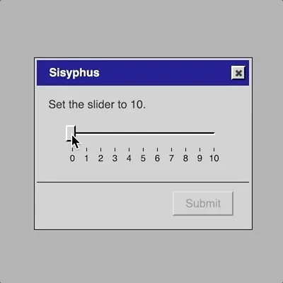
Created Sisyphus yesterday (Sunday) in a quick burst - the beauty of having extremely simple, well-defined ideas for what it is you're trying to achieve. Created this gif of it, which conveys the whole thing nicely:
Very validating to post that on Twitter and have it up to over 1000 likes in less than a day. I mean, not that that's the objective here, but after a pretty tough spell of making stuff that hasn't really captured people's minds quite as much (and yes I'm just complaining) it feels good to have something accessibly interesting to people. Very easy to imagine nobody giving a shit about the game proper, but at least the idea appeals.
So Sisyphus works really well, it's effectively done already, no obvious need to do more than confirm it'll work out okay on mobile and any other full-game level tweaks to things.
Danaids
Built a version this morning based on the premise of dragging a file to a folder and having it revert. Obviously very easy to implement but having implemented I'm not quite blown away. I think it's a fair representation but
- It does feel very similar to Sisyphus
- It perhaps doesn't quite give you the right idea about the water vanishing, since you just get it back - in the myth its not like they were recycling the same water each time, they have to go and get new water
- It feels like it's on the edge of breaking the interface level consistency because all the others are using standard UI elements which implies these things are little dialogs/control-panels, and yet Danaids is kind of pretending to be a file browser window
So those are all problems that, together, make me less than certain about it as a result. It's fine and it works okay, but it's certainly not at the level of the others?
Looking at the available UI elements isn't inspiring much either. The progress bar is the most obvious representation of water filling a container, so one could imagine using that more directly? "Fill the water progress bar"? And then figure out an interaction that you use for that, with it just sinking bank down. Even just a button? Though what kind of interface involves that? There's also the classic Windows file copying animation that could be worth a thought?
In that version perhaps it's drag and drop still (with its related problems) but it launches a new dialog with the copying process and a progress bar, and that just goes on perpetually because the progress bar keeps slipping back? That would at least feel like a more coherent representation, but doesn't dodge the problem of swapping to a file-browser model of one of these dialogs? It's not the end of the world but I don't love it... might at least save that version.
Tantalus
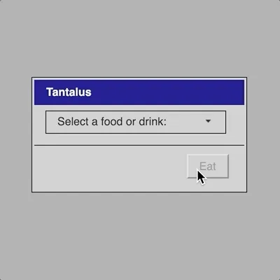
This one just worked out well like Sisyphus - by being incredibly blunt and simple. A dropdown menu where you can't select the things you want to select, a pretty perfect analogy to Tantalus's situation - he can see what he wants/needs, but he can't reach/access it. And scene.
Usability and Punishment
Something that's apparent from this progress is a kind of funny relationship between the ideas in these punishment myths and ideas around usability. As I wrote in commit 5cf58cd, there's a sense in which the punishment is a matter of usability in both directions: if the interfaces were usable/accessible, then you'd be able to complete them because they wouldn't commit horrific usability gaffes like having no selectable options or (more bizarrely) having a slider that resets itself.
On the other hand, there the usability at the level of the punishment - a usable punishment, where the objective is specifically to make sure the interface is efficient, memorable, etc. with regard to being punished. In particular, this means avoiding any circumstances where the user might get out of the punishment through some clever use of UI. On Twitter people suggested things like using the tab key to select a value instead of the mouse, or dragging the slider to the top and then hitting enter to submit so it can't reset. Specifically removing those possibilities is an important part of the usability of this experience.
In a sense a standard user-interface is a really perfect representation of those ancient punishment myths - it mirrors them very well. You have the need to perform an ostensibly simple task (in many cases at least - run to a flag, pick an apple, push a stone), but the circumstances/interface won't allow you to do so. In a way I find Danaids the most interface-y of the different punishments because it's so clear (I guess Tantalus is too) - you can see the holes in the bathtub from the beginning, so it's a clear piece of interface design that signals to you everything you need to know about your punishment. Even as you're compelled to carry out the task anyway (by the gods or by the interface's refusal to be dismissed [unless you exit everything of course]).
? Danaids feels a little underwhelming right now, perhaps just too close to Sisyphus in the way it appears with the reversion? Though that's not necessarily a bad thing given they all effectively telling the same fundamental story of infinitity and thus some sense of a "reset" that puts you back to square one. So it's not surprising you'd see that reflecting in the UI. That said, I think part of this project is surely to experiment with different UI ways of telling that. Danaids right now is distinct from Sisyphus but I don't quite know. The other thing to say about it is that using the desktop metaphor inside the app is a tiny bit out of keeping with the rest, so I should think about that too?
? Tantalus came together very well I think. The reveal of the select menu containing only "None" or two greyed out options is kind of perfectly what Tantalus is all about. Reaching for something only to find it's unavailable. Available in the sense you can see it though. So that's pretty ideal. I have a "Submit" button there too to imply the idea you're trying to progress out of the screen. (This is something else Danaids doesn't actually give you? Really need to think about it. Hmm.
? While working on Danaids and also while thinking about comments on Twitter on the Sisyphus animated gif I posted, it occurred to me that there's something funny here about how a certain element of the punishment is coming through specifically in issues of usability and accessibility. People on Twitter have pointed out things like using the keyboard to input the slider by dragging it, holding it, and hitting enter to submit. I really like that they think that way, and then also that that courtesy hasn't been built into this interface for you - hell is poor usability? (Or, in a flipped sense, the interface is perfectly usable for being interface-punished.)
Blog post: New project: Let's Play: Ancient Greek Punishment: UI Edition
One of my plans for this year is to work on smaller projects that are easy for me to understand and visualise how to accomplish. Last year I "lost my way" a little bit with game-making because I had a very fractured attention span. I also tried to be a bit too "serious" with a lot of my projects, so another aspect of this year is working chiefly on things that I find inherently amusing.
In keeping with this, I recently released Let's Play: Ancient Greek Punishment: Inversion Edition. It's my fifth edition in this series of games, all of which create and recreate the same Greek myths as videogames in different ways. At this point we've got the original "authentic" punishments, the art edition, the CPU-only edition, the "limited" edition, and now the inversion edition. I like working on these projects because they let me think and rethink the same constrained set of ideas from different vantage points. If nothing else it feels like it stretches my creative/design thinking not unlike games like PONGS and SNAKISMS did, but over a series of separate games instead of multi-packs of minigames.
Even before I released the Inversion Edition I got straight to work on a new edition which I'm now tentatively calling Let's Play: Ancient Greek Punishment: UI Edition. (I had been calling it the It is as if Edition, but it's a bit awkward.) In this version I'm recreating the same suite of five punishment myths, but using traditional user-interface elements (via jQuery UI) instead of sprite animations etc. Clearly this is a major aesthetic change, but I like just how much the spirit is maintained even with these very distinct interactions. So, for example, Sisyphus takes place with a slider:
Same basic experience of a task that can never be completed, but expressed in the language of UI design instead of retro pixel-art of the "literal" myths themselves. I think there's a lot to be learned here for me about expressing ideas in this new way, and I'm enjoying (and struggling with!) the process of working out how to translate each myth in a way that feels true both to the original myth and to the spirit of the series of games as I see it.
Assuming I can get my head back into writing stuff here, more will follow. Nice to see you again.
? Have some unresolved feelings about the way I wrote this code heavy on the anonymous functions to match up with the others. This one involves two intervals and other bits and pieces that make it uglier than I'd absolutely like. On the other hand it avoids scope stuff, keeping all the scope inside the function that creates the app, which is a good thing? Is it?
? The basic experience works pretty well I think. I find the positioning of the peck dialog directly on top of the Prometheus dialog kind of dissatisfying, but I also think it's appropriate so I don't know what to do about that. It doesn't look great, but it makes sense. I guess with a sound it'll probably hold together better because it'll be more of an event that you're paying attention to. You can move the dialog and it will appear in the new place, too, but I'm not sure I should allow that (may be better to generate the dialog dynamically each time to ensure positioning, or to reposition whenever it's opened).
? Also need to work on the wording in the Eagle dialog itself. It's not bad right now, but it's likely I can do better.
? Seems like just doing ultra-basic math works pretty well. Guess I still need to work out the precision limit somehow to see what happens to it, and of course to avoid any kind of over/underflow of the presentation of a float.
? Probably need some text beyond the statement of each step? Or is there a hilariousness about the correspondence between a "wizard" step and a race step? Such that I don't need the actual process to be about anything? "Almost there"? A generated "almost there" statement from a set of possibilities, which would be kind of a nice reference to the ways these interfaces try to convince us the process is just about finished when we're exhausted and bored?
? With this I technically have drafts of all the interfaces, with only Danaids feeling genuinely out of shape and unready.
? As discussed in the process journal, this just feels like a more natural fit with the rest of the interfaces in terms of relying on control-panel-related interactions rather than jumping to a different kind of metaphor.
? Naturally this it quite close to Sisyphus because those two punishments have similar conceptual make-ups: in each you perform a physical action which is then reversed. I can distinguish them here at least in terms of the immediacy of the reversal - Sisyphus presents a kind of "continuous effort' in dragging the slider (as well as the physical metaphor match with the boulder) while Danaids presents a discrete effort, representing "pour the water", which then empties out. I think it works pretty well.
? With this, I have working drafts for every interaction in the game which is kind of amazing. Remaining things to think about revolve around texts, sounds, and mobile implementations.
Sound, the spareness of Zeno's steps, designing for mobile
Time to give some thought to what remains and to make sure I understand what's needed, as well as to poke around at some solutions.
Sound
It feels like the experience will be improved with sound, but I'm unclear on how much is needed. There's one version that's restrained to standard sounds like a dialog appearing, and another more slapsticky version where the various failures could make sounds (e.g. a sliding sound for the slider dropping back) or a button activating could make a sound (a nice ding or whatever). Some of the dialogs are basically completely non-interactive (e.g. Tantalus) and would make no sound?
I think it could be funny to have the slapstick level of sounds, but I'm not totally clear on how much in the spirit it is? Is this thing more about the nature of UI and being accurate to UI (while managing to retell ancient Greek myths) or is it about the comedy of the experience? It's a kind of authenticity thing?
Guess what? I should probably try both approaches. Default dings, and then throw in some of the others and see if it's an improvement or a bit much.
Zeno's steps
Right now Zeno works in the sense that you can take "infinite" steps toward your target, but it doesn't have any real content just the step itself. I've thought about whether that's actually funny and appropriate - each step just literally being a "step" along the way, in and of itself useless/meaningless except advancing you toward a goal, and of course the use of "step" in two senses... but just visually it may leave something to be desired?
I've thought about having the user/player select which foot to take the step with, but that seems most appropriate for a radio button and I feel like I've "used" that already in Tantalus and can't reuse it. That's a very, very arbitrary constraint, but part of the idea here is to vary which elements are used to represent the ideas - I don't know if that's a stupid attempt to be a virtuoso or if it kind of makes sense to the project.
Similarly thought of a little progress bar that just loads and then you can take the next step, but that seems really artificial and unnecessary?
And another option would be to have some kind of text appear (generated?) that continuously assures you you're almost done etc., as you do see in these kinds of interfaces. "Just a couple more things" "Almost there" "Just about finished" etc. But then that's pretty weird is there aren't actually any "things" to be done...
I should probably at Windows wizards and Zeno's paradox to see if anything jumps out...
- A "welcome" message is fairly common and can set context, that might be worth having at step 1? Or even before it?
- A lot of radio buttons and checkboxes involved in a bunch of them
- I guess a checkbox isn't the worst thing? Maybe you can just agree to each step? Or possible a range of options each time? They could be totally optional? Generated?
- I should be cautious about having too much stuff in this one? Don't want to overcompensate and end up with tons of extraneous things - part of this project is about a kind of austerity of interface? It's okay if it's repetitive...
It's not impossible that with a Welcome stage the subsequent steps just don't need anything? At that point I think the joke can land a little better and the starkness may actually work in its favour... that each step is just a step. The Welcome screen can (hopefully?) kind of hint at that double meaning?
Mobile
Ugh. The least fun element of all. I suppoooooooooose I should care about this right? I have absolutely no real vision of how much traffic to my site comes from mobile. Maybe I should find out? Shit, it's not totally insignificant. 85,000 hits on my github for mobile devices in the last two years. (Compared to 200,000 for desktop.) Shit. Fine.
Okay well part of this is just "get the UIs working and see what happens. Let me see how it behaves right now...
Well. Impressively Danaids which is showing up right now just works fine which is a little shocking. But I'll take it. Or rather, you can click things and they respond and you can drag the window around and so on.
But a) the icons on the desktop don't work so you can't open them and b) rather more importantly, the games rely in some places on a "mouse out" (e.g. Danaids) that can't be checked with touch because it's effectively just clicks. Whoa. So what would be affected by this problem?
- Danaids relies on mouse out of radio buttons to switch back to empty
- Tantalus is fine
- Prometheus is fine
- Zeno is fine
- Sisyphus... I don't know, but should be fine since it's listening for a mouse up?
That being the case I suppose it's not impossible to reimagine Dnaids "enough" that it can work again? Maybe a two step process so you fill the bath and then do another thing, but then that causes the bath to empty, and so on? Hm.
So that's the design versus affordance part of it, and then there's the appearance part of it. Tempting though it might be to just say "fuck it" and leave it along, I suspect that's bad karma. It seems like at least on smaller devices (phones) it would make sense for any given dialog to take up the whole screen modally so you don't have the sense of launching multiple elements (again this will require a reload to get back to the start then). That being the case there's CSS bullshit to consider in terms of it looking alright? Ideally just at a certain screen width it creates a dialog that's sized to the window width and blacks out everything behind it (or grays) so that you're just looking at that dialog?
I'll have to experiment a touch. It is as if you were making love should at least have some clues for getting this done. Not the end of the world.
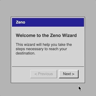
? I think the welcome screen really does its job in terms of setting it up as a more "real feeling" user interface experience with various expectations/connotations that make it a funnier setup. It allows the spareness of the individual steps to be the punchline rather than the whole joke. I think the language here is pretty funny now which is nice. May need some tweaking on it, but we shall see.
? And reorganising the files just made sense because it was getting a bit out of hand and they are distinct entities so why not?
? Tried doing this "manually" with CSS I found online but it was very fiddly and ultimately didn't yield a very nice result, so I went with a math library called MathJax. Kind of overkill I guess for a single sigma expression, but it looks just right and it handles some of the annoyances like really large values for 'n' that would have been annoying to do myself. Looks beautifully mathematical. So now when the basic function of (step = step + (2-step)/2) loses its precision (by eventually reaching 2) we switch to a sigma expression in order to be able to carry on. I chose to leave sigma mode on even if you go backwards just because I think that's funny too, all the way down to n=0 for step one (E(n=0 > 0)(1/2)^n).
? Spent time using an online Sigma Calculator (https://www.mathsisfun.com/numbers/sigma-calculator.html) to check certain answers and then hilarious as I tried to calculate a really high value of n (notably for when it exceeds the precision) found out it just returns 2... because it's implemented in JavaScript. Ha ha. Same precision problem obviously. Loses it at n=53 just like my one. Heh.
? Yes, I am aware there's yet another fallback needed which is when the representation of n exceeds the precision of JS, so at that point we have to switch over to a textual representation of the step like... "almost there" or something? But this would happ/en after 9007199254740991 steps (JavaScript's MAX_SAFE_INTEGER) which... well even with an autoclicker clicking at 60 frames per second that will take... close to 5,000,000 years? The power of sigma eh? (Could be wrong on that math. Sue me.)
? I mean, this is pretty cool, right?
? Struggled briefly with how to deal with going backwards in this scenario - should you be able to get back to the sigma expressions? Notably if you press previous immediately after going to the text version? But to do that would introduce basically an infinite regress of my tracking how far beyond the maximum integer they'd gone, which is itself an integer and so on. But to just leave them in the world of "almost there!" when they're in fact going backwards makes no real sense either. Rilla's suggestion: just never have previous enabled, which I think is very sensible indeed. It's fitting that the only way is forwards, and that completely eliminates the problem. So if they spend the requisite 5,000,000 years getting to the texts, there they will be.
? Didn't like the thing of the peck appearing separately from the prometheus dialog, and it's possible to specify its position to centre on its "parent". However it turns out that if you drag it elsewhere that takes precedence and overrides the positioning, so I felt like I needed to disable drag to avoid that scenario.
? Don't want user resizing. My interface is perfect...
? There are all niceties to make it work as a mobile experience. Kind of "cut the baby in half" a little bit with the mobile app representation. It loads as a single app with no way to quit, but it just displays a dialog box on a grey background. I think that's true enough to the experience I want - I'm not about to recreate all the UI in a mobile-appropriate form, so there you go. It looks kind of cool frankly.
? Still have to solve for the issue of how this should look on an iPad? Current don't capture that properly so they'll be treated as a desktop I guess? But actually that's possibly okay anyway? It'll still pick up the touch, it just won't load as an app? An iPad is big enough that I don't think it's a big deal? Yeah, looking at it it just kind of works fine, so I don't think I care about it in the end. Nice.
? Still wonder about random positioning of dialogs on larger screens so that it's a bit more visually interesting - if they launch all of them in the centre it'll look a bit of a mess?
? Lots of tweaks basically to get the mobile version looking sufficiently accurate while not expending too much effort.
? Look 'n' feel man, look 'n' feel
? Need to test mobile for whether it's still possible to hit the submit button before the first stage of emptying hits
? Some very ugly coding to remove keyboard input and to remove focus for elements that get it (radiobuttons, selectmenus). Veeeery slightly annoyed that I can't prevent keyboard changing the (disabled) options in the Tantalus menu, but I suppose it does no harm? Everything else seems successfully eliminated as far as I'm able to tell?
? This is starting to get pretty fidgety to my mind, but it seems moderately needed. I like the icon backgrounds anyway since they allow me to restore the key colours of the other versions of the games which is a bit of a nice thing. Still a couple of things to think about yet, but it's almost there?
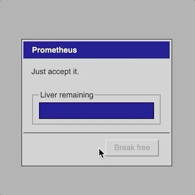
? The Prometheus language pass was a good thing to do as I think it's significantly better now. The instruction is "Just accept it" which is nice both as a reference to the UI and in terms of the philosophical position to take, it's also a frustrating thing to be told by a UI which is funny and a punishment in itself. Added a disabled "Break free" button to reference the chains. Labelled the liver progress bar so it's a bit more clear that's what it is. Changed the language to losing "a tenth" because feel like that is better at not implying a tenth of what remains but rather a tenth of what was there in the beginning? That's pretty nit picky.
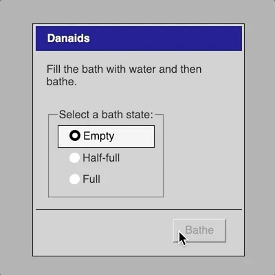
? To try to avoid the fast-fingered tap in Danaids I just sped up the emptying. Still looks fine and animated, but no longer seems possible (for me?) to click the button. Also changed the label on the button to "Bathe" to get the right language in there a bit more.
? While at it, changed some of the "Submit" buttons to more narrative labels... I think it's fair now that I know that the majority of the UI is functioning as normal UI, so it's a bit fun to have just a bit of the myth language in there? Eat for Tantalus for instance. Actually this creates a vague problem with Sisyphus which doesn't reference the myth at all? Yikes is that a problem? It's actually the odd one out now?
At the end of the game
Let me at least review the previous ideas in the context of having made the game...
Repetition and variation
I think this is part of things in one sense but not another. I'd somewhat imagined this game as a remake of the original game, but in fact while making it I don't feel that I've been thinking in terms of how to make the UI represent the game. Rather it's been about taking the original concept of the game (the myths) and looking at how to translate them into a particular interactive language - previously 8-bit-ish games, now Windows95-era user-interface. So it's a continuation of the concept.
Which is good and fair - each of the series have varied the way that you might represent/think about the original myth in the context of a videogame or some other aspect? Well, perhaps Art Edition was more about the original game itself and the idea of layers of representation. But the others have been about the original myth transformed through some idea of videogames (CPU players, the ability to always win/succeed, the flexibility of which role you play). And this new one is a transformation/variation in terms of the actual user-interface representing the myth.
Translation
Clearly an important one. As above, not so much a translation of the original game as the original myth and concept for the original game. This is also true for a game like b r 1 vis-a-vis v r 1 for instance - it's not a straight-up remake because that wasn't possible, rather it's readdressing the same idea (variations of Schneider's u r 1) from a new vantage/platform/interface. And that's what we have too - the idea of mythological punishments as interactive experience we can present (very well) on a computer, with this game being the translation of that concept (and the specifics of each myth) to the interactive language of Windows95 era interface design.
(As I'm writing this I'm getting tickles of my worries in today's Process Journal entry about my use of language in the game and whether it strays too far into the actual language of the myths instead of staying in the language of the interface. But to which side does language belong? What's right or wrong?)
In fact perhaps one thing I can just say (to myself at least) about the use of language is that I'm trying a number of different positions in this game, all valid. I don't think the overall experience needs to necessarily have precisely one voice - it's an experiment? So Sisyphus is effectively purely in the language of UI with no reference to the myth other than the metaphorical interactive level. Zeno is a lot like a Wizard, so sticks to UI language, but there's more of a winky correspondence between the UI language and the myth language (a step, a goal, taking the next step). And then something like Prometheus or Danaids or Tantalus are much more about quite literally trying to represent the myth stuff in language AND interface elements - which is in part why the interface elements are perhaps less strong or those? Well I think Tantalus is quite smart actually, the correspondence of "disabled" elements and "withheld" objects is a nice one. But perhaps Danaids and Prometheus are less ... well Prometheus is pretty good too really, the idea of "Accept" having a double meaning is nice, and the idea of a UI encouraging you to passively accept, as well as the disabled break free button to represent chains.
Okay okay, it's pretty good, with Danaids still clearly representing the one I'm least happy with.
User-interface and Expression
Fair enough still too. The question of what kinds of ideas are expressible in a user-interface language (many) has definitely been part of this process. I feel like I'm just affirming what I already wrote which is maybe not the most revolutionary. The game was certainly a chance to explore how to use a UI expressively in perhaps a different way to its intent.
Importantly, I guess, it doesn't rely only on the language/content but most of all on find interactions that represent the core nature of the punishment/myth. Zeno is the best example of this I think - the use of a Wizard format to convey the idea of an infinite "race" is pretty great. Took a while to find that as initially I was thinking about elements that can be recursive or "fractal", but the Wizard is much more elegant than that.
Summary?
I don't really love writing these things at the end, the summaries, because I guess I just want to be done with it. But I really do need to put together a proper bit of writing that I can put out there for people to understand. The uh... the... "closing statement" idea. Where I pull together the key thematic ideas and link to commits etc. etc. Would make sense. I can write that after release, but of course the further I get perhaps the less likely I am to write it?
Well just broadly speaking: I'm happy with where this game got to from the initial vision of the Sisyphus slider, and I'm particularly happy that was able to largely equal the design ideas of that first image with other experiences that are interesting in their own ways, and particularly Zeno. Always Zeno.
Mobile; Mobile Danaids; Language Games; Nearing the End
Mobile
Over the weekend I managed to get a proper mobile version working (touch wood etc.). Pretty much followed the plan from above in terms of what it looks like - each app launches solo against a grey background so you can't have multiple open, app icons are styled to look more like iPhone style stuff along with appearing in horizontal rows instead of a column.
Mobile Danaids
Also needed to rework Danaids a bit to make it mobile "unfriendly" (ha ha) - I added a "half-full" radio that allows me to switch from "full" more quickly because there's more of a visual clue as to what's happening. Now it switches fast enough that you don't have a chance to click the button (as far as I can tell). Oh, and looking at the previous entry I suppose I should explain that I changed Danaid's to a timer-based thing for going from full to empty to avoid needing the mouse-out.
In fact I think the timer based version is kind of truer to the real thing right? The point is that the bathtub has holes, so naturally it's going to start emptying as soon as you fill it, rather than waiting until you move your mouse/finger away. It feels a little weird in terms of not being 100% sure it's impossible to click the button before the bath empties, but I think it's probably sufficient in the end.
Question: it it fun to have even more radios? Like empty, quarter-full, half-full, three-quarters full, full? And also is it a nice idea to invert the order so that full is at the top which makes more physical sense? Which brings me, somewhat, to...
Language games
I did passes on all the games looking at the language use. And I ended up changing language in a bunch of places so that it reflected the actual myth more than it had been. E.g. Tantalus was about selecting a food and then there was a "Submit" button, more in keeping with the idea that it's a user-interface for achieving that goal, whereas now it says "Eat", which is more about a user-interface which represents that actual activity.
I think I like it, but it's interesting to me how distinct those two approaches are, while also existing (I think) on the same spectrum. A question of how much these interfaces are about representing a myth versus representing ideas about interfaces (through reference to the myth)? And in the end the game is about representing the myths (I mean the series of games) so I suppose it's fair to use the myth language. But I still feel like I'm losing something by not having the studied neutrality of interface language. "Submit" is so impersonal (and frankly also great in the context of punishment - though perhaps that makes it confusing).
Additionally, of all of them Sisyphus just doesn't have it at all - you're just setting a slider to a specific number. So in a way the game that began the whole thing is one that doesn't seem capable (?) of being done in the myth language style? You could label the slider with "bottom" and "top" I suppose, and have the instruction be "Move the boulder to the top of the hill" but that seems kind of off somehow.
Additionally, Zeno, which is my favourite at this point (perhaps I'm just biased by the sigma expression - something I see I haven't mentioned in this journal, but see commit ac9f78d) also doesn't really use the myth language except as the joke about the idea of a "Step". It's very much in the world of the UI quite fundamentally.
It's a bit like a tension between the Ancient Greek Punishment series and the It is as if series. Both are really interesting I think, and good things to do, but they have different attitudes to narrative stuff? It is as if is about having a narrative but not telling it directly (I think?) and instead providing the interface to the story without saying that's what it is so overtly. The Punishment games are about telling the narrative quite literally through interactions that are in service of the story and don't have their own specific resonance? Is that true?
So I honestly don't know what to do about that - it's not necessarily something everybody would notice (the language stuff), but I do feel like it's a big of a rough edge that I could fret about. I'll keep it in mind.
Nearing the end
Well, the project is all but done. It's probably releasable now other than this language thing and a couple of very small CSS things I might or might not actually fix up. I think it's a good piece of work (though I felt ever so slightly weird showing it to people at the baby shower yesterday - but I think that's just generally how I feel about being in the same room as my own work, intensified by being the one showing it).
(Actually, making sure the game is accessible from my phone definitely made it so much easier to show to people which was pretty cool, including the niceness of having my own little icon I can launch it from. So I definitely think that's a good one to remember moving forward.)
I guess I look at it a bit more this morning and then probably call it a day. I'll release it next week I imagine, so should attempt to have press kits etc. done by Thursday or Friday? Release on Tuesday? Wednesday? Wednesday might be better because I don't have a class to deal with.
I should probably revisit my other process documents, too, to see if I can fill anything in a bit more. Process wise I think the project has been successful... I've done substantial documentation in the commits - a lot of the moment-to-moment design stuff is in there (e.g. I didn't even write about sigma stuff here, but it's in the commits). And this journal has been more big picture, which I think is right. As for the rest it's more patchy, but that's okay, still learning what that stuff is for?
Post-press kit, pre-closing statement
The project is basically as done as it will be at this point, all the way down to its press kit which I put together last night. Decided against having a trailer separate from the animated GIFs illustrating each minigame. I think they're perfectly effective at illustrating what this thing is all about.
The big remaining thing it to write a closing statement for the game, as this is something I've kind of drifted from in the last couple of attempts. Simply because: it's hard. But it makes a lot of sense to do it as a final revisiting of the overall project, a first attempt (by the developer) to look at all the process material produced and to try to tell a specific story with them. And really a story about intent and a (very subjective) evaluation of success (pre-release I suppose).
I don't think I should hold off on the closing statement until after release because I'll inevitably have started something else and the impetus will be kind of lost, all the thinking will have drained from my brain like a Danaid's bath.
So, let me at least start by reading everything and listing thematic areas as well as potential commits to reference? I guess? Plus potentially images that illustrate any little stories that might be illustrative of process? Gosh I don't know. How long should this thing be? Doesn't matter. (For reference the b r 1 one was... just shy of 2,000 words. Okay.)
Well anyway here I go.
Closing Statement: The unusable usability of ancient Greek punishments
Let's Play: Ancient Greek Punishment: UI Edition (hereafter: UI Edition) is the sixth game in my Let's Play: Ancient Greek Punishment series. Each of the games has retold ancient Greek punishment myths (somewhat loosely defined, given the inclusion of Zeno's Paradox) from different perspectives, whether focusing on presenting them straightforwardly as a punishment for the player to experience, as a meditation on whether a computer can punish itself, or what it's like to be the tormentor instead of the tormented. In the following, I want to write a little about the key features and themes of the games development and intent.
Origin story
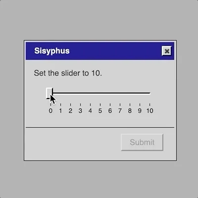
The UI Edition proposes a translation of the myths away from the language of pseudo-retro minigames and into the language of conventional user-interfaces. The idea for the game itself began when I assign my programming students a project to build a "Sisyphean experience" using jQuery UI, a JavaScript library that facilitates the creation of traditional user-interfaces (and which I have used in the past for It is as if you were doing work and It is as if you were making love). In assigning the project I saw an image of a slider, diagonally oriented, with the user dragging the handle to the top only to see it slide back down, a UI-mimicry of the Sisyphus myth. The comedy value of this, along with the challenge of reimagining the myths in this different domain was enough for me to decide to go ahead.
Turning on the wheel of usability
One of the more interesting outcomes of choosing to work with traditional UI elements was the immediate connection it made to tradition UI concerns such as usability. All videogames deal with usability (such as making their controls accessible and understandable, say), but when your game is a user interface it feels magnified. Specifically, a game tends to need to be usable in one direction (the interface itself, the menu systems) while being "unusable" in another direction (the challenges presented by the gameplay), though also being secretly usable there too (the challenges are, usually, designed to be overcome).
With this game, I found myself thinking extensively about the role and significations of usability concerns. Thus, for instance, I found it necessary to remove certain usability-enhancing features of the elements, such as the ability to click on the body of a slider to set it rather than drag the handle (commit 47a13ab). Relatedly, when I posted animated GIFs of the project online, one form of feedback was people citing how the game could be beaten by resorting to other forms of usability and convenience, such as keyboard shortcuts, prompting me to immediately remove those possibilities (commit 5cf58cd).
In fact, the context of punishment being the core of the game is even more bizarre when thinking about usability. The core loop of the punishment needs to be "usable" in the sense that you need to be able to perform the task (Prometheus can struggle to dislodge the eagle), but totally unusable in the sense that the task cannot be completed (Prometheus can never escape his chains). I wrote more about this question of usability and punishment in the process journal.
Language games
A big vector of design I hadn't actually thought of when embarking on the game was the roll of language. Where the previous games in the series have communicated the current state through graphics, this game needs to communicate in a combination of user interface state and texts that clarify that state. The most obvious example of this was the Zeno interface, which I struggled with significantly until I found the right language for it: the classic step-by-step process in which you click a "next" button. The fact these dialogs are called "steps" is pleasing given the dual meaning here of a step in the UI progress, but also a metaphorical step in the footrace Zeno is literally running in reference to the previous games (commit bb9a275). Zeno was completed properly at the moment I realized that these step-by-step interfaces are typically "Wizards" in the Windows context and that those wizards have specific language involved, such as a "welcome" screen that gives meaning to the overall process. Having a welcome screen allowed me to set expectations for the ensuing steps, making their bluntness (you just take step after step with no real effect beyond the step count) more of a relentless punch-line rather than needing to serve as the whole joke (commit 8163eff).
Beyond Zeno, all the games ended up needing language passes as I tried to balance the studied neutrality common to user interfaces alongside the desire to convey the context and richness of the mythological basis for each interface. Notably, I needed to think hard about whether the conceit of the game was more to represent these punishments purely as their interface equivalents (and so without "narrative" content), or whether it was to "retell" the stories in the language of UI (in which case the narrative could still be present) (commit 69ea7fe). Although I largely decided on the latter, I think there's still a range here, from the more interface-leaning Sisyphus to the very clearly narrative Tantalus.
By way of a simple example of all this, consider the possible labelling of a "submission" button for a dialog (generally disabled because the dialog cannot be completed). Initially they were all labelled "submit" in keeping with UI traditions, but after my language passes they tended to be labelled with more myth-relevant actions such as "Eat" for Tantalus or "Bathe" for the Danaids. (See more in the process journal here and here)
All interactions are physical
In contrast to these more conceptual ideas conveyed in language, I was also very interested in the "physicality" of the UI interactions. Generally speaking these kinds of interactions are meant to be relatively invisible or transparent, but as I worked on the game it seemed to me that it was important that there was some kind of physical metaphor at work in each beyond just the language. Thus consider how in Tantalus it's just just the case that the options for food and drink are greyed-out and inaccessible but that you literally reach for them with your mouse (just like Tantalus) (commit 5cf58cd). Likewise as Sisyphus you physically move the "boulder" (slider handle) and as Zeno you consciously "take each step. It's not always present, but where possible I found it really satisfying.
A good negative example here is the initial version of Danaids which was to be represented as dragging a "water.png" file into a folder called "bath" in order to represent filling it. The file would always revert back out of the folder to represent failure, but in physical action this didn't feel like the bath emptying but rather like the bath "rejecting" the water, which didn't feel true to the experience. This worry was present from the very beginning of my process journal, signifying how important it was to me in the design. The eventual solution using radio buttons that went downward from "full" to "half-full" to "empty" on a timer is another indication of trying to mimic a "physical truth", the water runs down out of the bath other time (commit 802e0b3).
A related design moment came with Tantalus which initially had "None" as a selectable option so that it could serve as the default, but which seemed incorrect because it seemed to convey the idea that Tantalus might willingly choose not to eat or drink, which isn't part of the myth. As such, the interface was redesigned to have the instruction be the default option, using the selection menu itself to display its instruction (commit 84eec14, or indeed jQuery UI's examples for the selection menu element).
Playing with the player
One pleasure of making games is the unanticipated uses that players may make of them, but a further pleasure is trying to make sure you second guess your players enough to give them an acknowledgment in the game itself. The clearest example of this is with Zeno which is an attempt to represent explicitly an infinite sequence, something that's hard to do. Specifically, each step is numbered with a fractional number getting closer and closer to step 2 which means that as the player clicks further and further in, it becomes impossible for JavaScript to maintain the precision of the number (left to its own devices the number would get so close to 2 that JavaScript would just write it as 2 and Zeno would be free!). To acknowledge such a dogged player, when the game would run out of precision it switches to a Sigma Notation of the current step, a mathematical representation of what the current step's number is. When I worked this out I was so happy (commit ac9f78d) both form myself and for the ideal player seeing I'd thought of this for them.
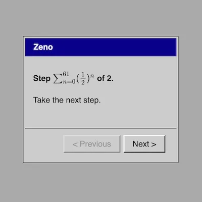
My calculations suggest it would take around 5,000,000 years to exhausted the precision of the numbers involved in the sigma expression even if you clicked 60 times per second, so it's pretty safe, right? But still, it's finite and the punishment is meant to be infinite (acknowledged in commit ac9f78d), so even after the sigma version would be exhausted I included a further step counting technique which is, in fact, infinite: peppy little messages telling you you're almost there (as a kind of prod at the eternal seeming progress bars we run into sometimes that try to make you feel better with encouraging pep talks about how they're almost done) (implemented in commit 982e66a).
Summary
Let's Play: Ancient Greek Punishment: UI Edition was a huge amount of fun to make. From a simple visual image of an impossible slider through to the actual challenges of designing and implementing the different myths from my previous games, it was a project the pushed me to think in some depth about the representations possible through traditional UI both at the level of language and interaction. It remains the case, I think, that performing these kinds of acts of "translation" of game design is an extremely valuable tool for thinking about how design itself works and how we make the decisions we make as designers.